I love being able to help others succeed. I think that is the best part of my job!
Tuesday, June 4, 2013
Thursday, February 21, 2013
Beer Label
This project was interesting. This client is a brewer. He had something drew out already.
This can either help you or be very tricky. When clients have something in there mind
of what they want, always makes things interesting! Sometimes using vector works!
In the end its great to see what your design ends up being.
This can either help you or be very tricky. When clients have something in there mind
of what they want, always makes things interesting! Sometimes using vector works!
In the end its great to see what your design ends up being.
Tuesday, February 19, 2013
Van Graphics
I was nervous, this was my first time doing graphics for a vehicle. I think I was afraid,
especially when its 6ft, and if you have any mistakes you can see them very prominently.
But, everything turned out great!
especially when its 6ft, and if you have any mistakes you can see them very prominently.
But, everything turned out great!
Flyer
I was so excited to make this flyer! When I get a chance to use
grunge, I defiantly take the opportunity.
grunge, I defiantly take the opportunity.
Bus Banner
This was my first banner on a bus. It was a great experience.
I love learning new things with each project.
I love learning new things with each project.
Birthday Invite
makes the project very difficult, especially when you have limited time. But in the end, everything
turned out great! Can you guess the theme? My client wanted to go with a "Little Miss Sunshine" theme. We decided to make it her own! "Little Miss Kennedy."
Baby Shower Invite
I love vintage, and using simple design elements. My secret to jumping into the zone is,
plugging myself in and listening to some great music.
Wedding Invitation
This was my sister and I's first wedding invitations that we designed.
We have the front, wedding invite, photo insert, ceremony, and reception inserts.
We decided to make things easier, that who ever was invited to reception, got just a reception card.
Those who were invited to the ceremony got the ceremony card. This was so much fun! We both
really enjoyed this project. It was alot easier to have an easy going client,
especially for a wedding invitation.
Flyer
Here is Live Deep Adventures Flyer, I have really enjoyed putting together
the corporate identity for this business. Next is to finalize there website.
I am very excited for the website, it will be great!
Business Card
it's sometimes tough, but I am defiantly learning new things with every freelance project.
Die cuts are very cool, but also can be very expensive. If you have the budget and a great
design idea, I think its a great way to stand out.
Monday, February 18, 2013
Logo
I made this logo for a great friend of mine who is starting his business in promoting natural movement as exercise. Also for getting out and enjoying the outdoors. He offers many types of fitness plans. The logo represents a tree that is "Living" and the roots represent "Deep."
"Live Deep Adventures"
"Live Deep Adventures"
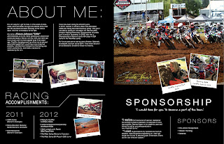
Sponsorship Resume
I was very excited and honored to be able to help this racer.
She has gotten sponserships from, Asterisks Knee Braces,
Pro-Action Suspension, R.A.D. wheels, and PanicREV.
It's great to help others to be able to chase their dreams.
Sponsorship Resume
live her dream. I thought it would be a great idea to put togethor a magazine layout.
The layout of this goes "Back" then "Front."
Logo
My sister and I worked with a couple ladies who wanted to change the community by having
a website/email newsletter of what activities and business that were being offered that nobody
knew about. They wanted to create a planner like schedule of events that was going on.
In there design "Sophie's" was goddess of wisdom. They wanted something that reflected
the goddess. After many thumbnails and roughs, this is what we came up with and what ended up being the logo for "Sophie's Planner."
Women's Conference
I love to use simple design elements such as lines and boxes.
Sometimes using simple shapes can say a lot!
Sometimes using simple shapes can say a lot!
Subscribe to:
Comments (Atom)


